
The Normal Model
The histogram showing the distribution of mean commuting times (in minutes) for 3,143 U.S. counties during 2010:

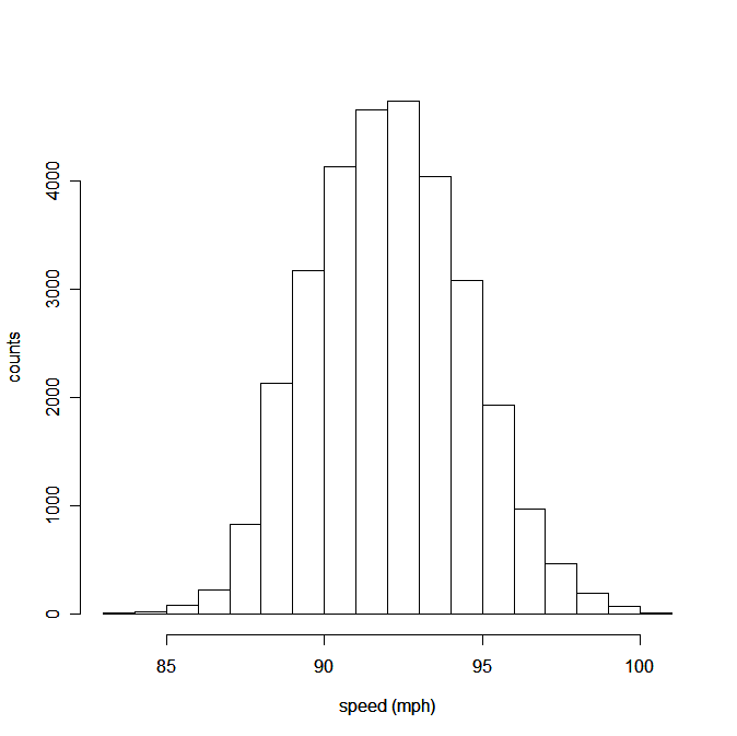
and the histogram showing speeds for all 30,740 four-seam fastballs thrown by 20 starting pitchers during the 2009 Major League Baseball season:
were both unimodal and symmetric. Furthermore, we might recognize their shapes as roughly "bell-shaped" so that we might try to model these distributions with a smooth, "bell-shaped" curve:

Neither of the histograms looks exactly like the model. Actual data almost never looks exactly like a mathematical model. But sometimes these models are useful, even if they don't completely conform to reality.
We call such a bell-shaped model a Normal model (not because other distributions are abnormal, but rather because this shape crops up with some regularity). When data can be approximated by a Normal model, it turns out that approximately 68% of the data is within 1 standard deviation of the mean:

For the commute times, the mean was 22.7 minutes and the standard deviation (SD) was 5.5 minutes, which tells us that 22.7−5.5 = 17.2 minutes is 1 SD below the mean and 22.7+5.5 = 28.2 minutes is 1 SD above the mean. According to the Normal model, we would expect about 68% of the 3,143 counties to have mean commute times between these values. In reality, 2,211 of the 3,143 counties are between these values, representing 2211/3143 ≈ 70%, which is not 68%, but is reasonably close.
Similarly, as shown in the graph above, we would expect 95% of the counties to have a commute time between 22.7−2×5.5 = 11.7 minutes and 22.7+2×5.5 = 33.7 minutes. In reality, 3,004 of the 3,143 counties, or 3004/3143 ≈ 95.6%, which is quite close to 95%, fall between these values.
Warning: Before using a Normal model you should always check that the data is at least roughly unimodal and symmetric; the more "bell-shaped" the data, the more accurate the model.
Exercises
1. [OIS 1.36] Infant Mortality The infant mortality rate is defined as the number of infant deaths per 1,000 live births. This rate is often used as an indicator of the level of health in a country. The (relative frequency) histogram below shows the distribution of estimated infant death rates in 2012 for 222 countries. (CIA Factbook, Country Comparison: Infant Mortality Rate, 2012) The mean number of deaths per 1000 live births is 26.7 and the standard deviation is 25.9.

a) Use the histogram to estimate the percentage of countries within 1 SD of the mean.
b) If a Normal model was appropriate for this data, what percentage of countries would you expect to be within 1 SD of the mean?
c) Do your answers for parts a and b agree? Explain.
2. [OIS 1.43] Commuting times The histogram below shows the distribution of mean commuting times (in minutes) for 3,143 U.S. counties during 2010. The mean was 22.7 minutes and the SD was 5.5 minutes.
a) What percentage of counties would you expect to have commute time below 17.2 minutes?
b) What percentage of counties would you expect to have commute time below 11.7 minutes?
c) What percentage of counties would you expect to have commute time above 22.7 minutes?