Technology: Scatterplots on the TI-84
So far we've looked at three basic ways to graph the relationship between two variables: mosaic plots for two categorical variables, side-by-side boxplots for categorical vs. quantitative and scatterplots for two quantitative variables.
The TI-84 cannot create mosaic plots.
To graph side-by-side boxplots, simply put the data for the first group in L1, then set up a boxplot using Plot1 in the StatPlot menu, then put the data for the second group in L2 and set up another boxplot using Plot2, etc. Unfortunately, a maximum of three boxplots are possible on the TI. After you're done, be sure to turn the extra plots Off to avoid errors cropping up when creating graphs in the future.
To create a scatterplot, let's use the size and 2007 assessed value data from the property tax data set we previously investigated as an example:
| house | size | assess | lot | taxes | stories |
| 20911 | 1561 | 304 | 0.2 | 2604 | 1 |
| 20912 | 1038 | 297.6 | 0.2 | 280 | 1 |
| 20918 | 1224 | 289.5 | 0.17 | 2353 | 1 |
| 20921 | 1232 | 292.8 | 0.17 | 756 | 1 |
| 20924 | 1995 | 314.6 | 0.17 | 2620 | 2 |
| 20927 | 1714 | 322.7 | 0.18 | 2632 | 1 |
| 20930 | 1832 | 336.1 | 0.18 | 2779 | 2 |
| 21003 | 1095 | 279 | 0.18 | 2321 | 1 |
| 21006 | 2011 | 319.5 | 0.18 | 2663 | 2 |
| 21015 | 1366 | 289.3 | 0.18 | 2415 | 1 |
| 21018 | 1292 | 301.4 | 0.18 | 2477 | 1 |
| 21023 | 1458 | 314.3 | 0.18 | 1386 | 1 |
| 21028 | 2031 | 320.9 | 0.18 | 2676 | 2 |
| 21105 | 1366 | 304 | 0.18 | 2473 | 1 |
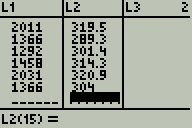
First, enter the data into two lists; here I'll use L1 for size and L2 for assessed value:

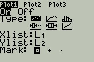
Then go to the STAT PLOT menu, press ENTER to select Plot1, move the cursor to On and press ENTER, move the cursor to the scatterplot icon (the first of the six Type icons) and press ENTER:

Now move to the Xlist line and type L1 and ENTER, then move to the Ylist line and type L2 and ENTER. You can choose whichever Mark you like most.
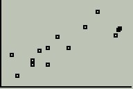
Next press the ZOOM key, move down to ZoomStat and press ENTER. You should see a scatterplot like this:

We see a reasonably linear association between size and assessed value, with no noticeable outliers and only a moderate amount of scatter. Notice that there are no scales or labels on this scatterplot. If possible, we should always include these on any scatterplot we use for a HW assignment, project or exam.
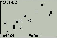
You can now press the TRACE button and use the left and right arrow keys to move the flashing cursor from point to point on the scatterplot; as you do, you should see the coordinates of each point listed at the bottom of the screen:

You might also want to use the WINDOW menu to adjust the scale on each axis.