Two Quantitative Variables
So far we've examined relationships between two categorical variables and between a quantitative variable and a categorical variable, which leaves us with the situation involving two quantitative variables.
Property taxes
Recall the data about the single-family residences on a street in Edmonds, Washington, that we examined previously. The data set includes 14 cases (each house is a case), and the variables are: house number, the size (in square feet), the 2007 assessed value (in thousands of dollars), the lot size (in acres), the 2006 taxes (in dollars) and the number of stories. Here is the complete data set for reference:
| house | size | assess | lot | taxes | stories |
| 20911 | 1561 | 304 | 0.2 | 2604 | 1 |
| 20912 | 1038 | 297.6 | 0.2 | 280 | 1 |
| 20918 | 1224 | 289.5 | 0.17 | 2353 | 1 |
| 20921 | 1232 | 292.8 | 0.17 | 756 | 1 |
| 20924 | 1995 | 314.6 | 0.17 | 2620 | 2 |
| 20927 | 1714 | 322.7 | 0.18 | 2632 | 1 |
| 20930 | 1832 | 336.1 | 0.18 | 2779 | 2 |
| 21003 | 1095 | 279 | 0.18 | 2321 | 1 |
| 21006 | 2011 | 319.5 | 0.18 | 2663 | 2 |
| 21015 | 1366 | 289.3 | 0.18 | 2415 | 1 |
| 21018 | 1292 | 301.4 | 0.18 | 2477 | 1 |
| 21023 | 1458 | 314.3 | 0.18 | 1386 | 1 |
| 21028 | 2031 | 320.9 | 0.18 | 2676 | 2 |
| 21105 | 1366 | 304 | 0.18 | 2473 | 1 |
The house number is an identifier, but the next two variables are quantitative: size and assessed value. Let's graph this data to investigate a possible relationship between them. Because we have pairs of numbers (for example: size = 1561 and assess = 304 for the first house) we can plot these points on a Cartesian coordinate plane (which should be familiar from algebra). But which number should we plot first? In other words, which variable belongs on the x-axis and which variable belongs on the y-axis? We don't know if there is a cause-and-effect relationship (we don't even know yet whether there is a relationship) between these two variables, although is would be reasonable to think that the assessed value of a house is related to its size. And it's possible that a change in the size of the house (for example building an addition, or demolishing an attached garage) would somehow cause the assessed value of the house to change, but it's not at all likely that a fluctuation in the assessed value of a home would cause a change in it's size. Furthermore, the size of the house is known before the assessed value. For these reasons we plot the size first (along the x-axis) and then the assessed value (along the y-axis).
Plotting the point (1561,304) for the first house, the point (1038,297.6) for the second house, and so on, we get the following graph:
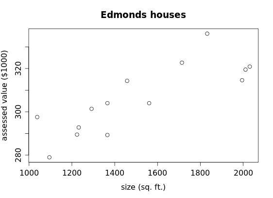
We call this graphical display a scatterplot.
We call the variable along the horizontal (x) axis the explanatory variable and the variable along the vertical (y) axis the response variable. A change in the size of a house appears to explain (in part)—but not necessarily cause—a corresponding response in the assessed value. We've see this at work before, but did not use these terms. For example in our mosaic plot of two categorical variables (gender and beverage preference):
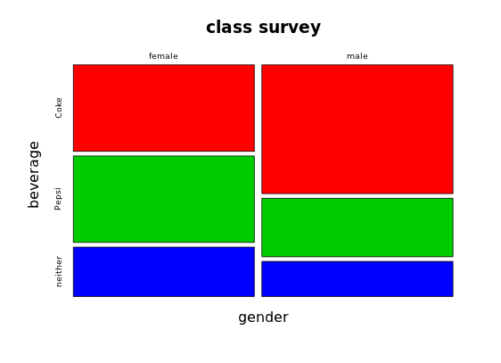
we placed gender along with the horizontal axis as the explanatory variable and beverage along the vertical axis as the response variable. A person's gender might explain their preference for Coke or Pepsi (and there's a remote possibility that their gender course cause—through some sort of chromosomal influence—their preference for one of these beverages), but it would be ridiculous to assert that drinking Coke or Pepsi somehow causes you to be male or female.
Similarly, for the checker data:
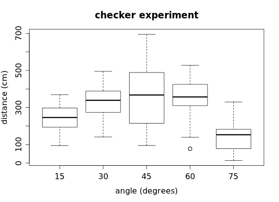
we positioned angle as the explanatory variable and distance as the response variable: here it's reasonable that changing the angle of inclination when launching the checker somehow affects the distance the checker travels (plus, we set the angle first and then launch the checker to record the distance).
Returning to the scatterplot of the house data, what pattern (if any) do you see in the display? If there were no relationship at all between the size and assessed value of the houses, we would expect to see no pattern whatsoever—for example, something like this:
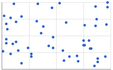
But we do see pattern in the house data, so there does appear to be a relationship (or association) between size and assessed value for these houses. How can we describe that association?
First it appears that the bigger the size of the house, the bigger its assessed value, so we say call this a positive association. (A relationship where bigger values of the explanatory variable are associated with smaller values of the response variable would be a negative association.) In the examples below, all of the scatterplots in the top row have a positive association while all of those in the bottom row have a negative association.

You might also notice that in both rows the scatterplot at the far left exhibits a very weak association, while the next one appears to have a moderate association, the third one a fairly strong association, and the last one a perfect association. Referring back to the house scatterplot, we might describe the association between size and assessed value as being "moderately strong" (certainly not "weak" but neither would it be "very strong").
In the eight examples above, you may notice a common feature: all of these associations appear to be linear. We use "linear" here not to mean that all of the points fall along a perfectly straight line (as in the case of the rightmost scatterplots in each row) but rather to indicate an absence of bending or curving in the association, as we might see here:

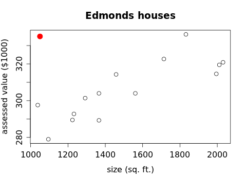
Finally, we look for any unusual features, such as an outlier that strays far from the general pattern visible in the rest of the data. In the house scatterplot there is certainly some scatter present but no obvious outliers, as would be the case if someone built a small but expensive house in the neighborhood:
Exercises
1. The Ford Focus is a compact car introduced to North America in 1999 for model year 2000. The table below shows the model year, mileage (in miles) and asking price (in dollars) for all 14 used Ford Focus automobiles advertised for sale on the Web site of the Seattle Times on January 31, 2010.
| year | mileage | price |
| 2007 | 25426 | 14595 |
| 2008 | 49223 | 13991 |
| 2008 | 49028 | 13991 |
| 2008 | 27690 | 11994 |
| 2008 | 36216 | 11980 |
| 2002 | 71646 | 10991 |
| 2007 | 41107 | 9671 |
| 2002 | 83454 | 8991 |
| 2007 | 49443 | 7988 |
| 2007 | 34179 | 7499 |
| 2002 | 63439 | 7475 |
| 2005 | 43012 | 5400 |
| 2001 | 86681 | 4494 |
| 2002 | 113000 | 2000 |
a) What type of association would you expect to see between mileage and price?
b) Which would be the explanatory variable?
c) Which would be the response variable?
d) Create an appropriate graphical display to investigate this association.
e) Describe the association visible in your graph.
f) Does the graph confirm what you expected to see in part a?
g) What type of association would you expect to see between year and mileage?
h) Create another graphical display to investigate that association.
i) Does the graph confirm what you expected to see in part g?
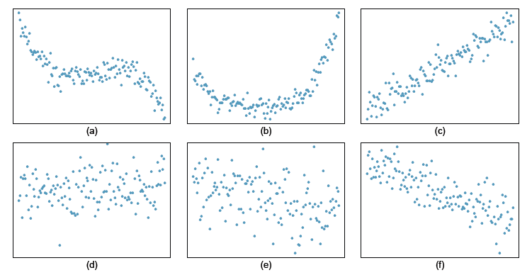
2. [OIS 7.3] Describing relationships For each of the six scatterplots below, describe the strength of the relationship (e.g. weak, moderate, or strong), the form of the relationship (linear, non-linear) and the direction of the relationship (positive, negative, something else), and make note of any unusual features.

3. [OIS 7.4] More relationships For each of the six scatterplots below, describe the strength of the relationship (e.g. weak, moderate, or strong), the form of the relationship (linear, non-linear) and the direction of the relationship (positive, negative, something else), and make note of any unusual features.
