
Categorical vs. Quantitative
For an elementary school science fair, a fifth grader constructed a launching platform using a flat board and a rubber band, using it to launch miniature checkers across a room. He launched 50 checkers with the platform raised to an inclination of 15°, and then repeated the process with the platform at 30°, 45°, 60° and 75°. He measured the distance each checker traveled (in cm); the data appears in the table below.
angle dist angle dist angle dist angle dist angle dist
15 260 30 162 45 222 60 510 75 288
15 280 30 245 45 211 60 310 75 330
15 185 30 141 45 190 60 161 75 203
15 305 30 302 45 187 60 343 75 58
15 339 30 271 45 489 60 442 75 31
15 245 30 274 45 204 60 183 75 143
15 152 30 333 45 213 60 415 75 66
15 128 30 253 45 130 60 235 75 70
15 130 30 293 45 165 60 317 75 91
15 235 30 440 45 262 60 355 75 157
15 251 30 376 45 263 60 328 75 124
15 189 30 362 45 180 60 348 75 30
15 246 30 385 45 528 60 285 75 39
15 94 30 296 45 370 60 335 75 105
15 225 30 363 45 296 60 344 75 148
15 215 30 305 45 458 60 77 75 14
15 210 30 189 45 558 60 390 75 126
15 217 30 303 45 491 60 334 75 59
15 217 30 286 45 379 60 419 75 49
15 153 30 268 45 543 60 139 75 206
15 140 30 268 45 695 60 362 75 67
15 230 30 244 45 221 60 460 75 164
15 341 30 379 45 465 60 436 75 130
15 199 30 427 45 531 60 454 75 191
15 163 30 392 45 365 60 360 75 108
15 246 30 362 45 460 60 470 75 323
15 176 30 426 45 568 60 164 75 152
15 331 30 261 45 215 60 374 75 271
15 180 30 422 45 340 60 142 75 180
15 149 30 312 45 350 60 300 75 135
15 305 30 321 45 95 60 339 75 239
15 270 30 316 45 502 60 528 75 48
15 290 30 345 45 603 60 359 75 171
15 338 30 292 45 460 60 282 75 183
15 290 30 398 45 206 60 175 75 211
15 249 30 253 45 345 60 467 75 247
15 250 30 354 45 459 60 320 75 181
15 320 30 352 45 103 60 444 75 168
15 297 30 462 45 477 60 420 75 116
15 295 30 346 45 337 60 390 75 78
15 321 30 365 45 273 60 425 75 152
15 308 30 389 45 270 60 527 75 212
15 277 30 386 45 132 60 387 75 154
15 245 30 239 45 426 60 347 75 204
15 214 30 442 45 506 60 334 75 181
15 194 30 495 45 525 60 522 75 59
15 254 30 460 45 376 60 421 75 166
15 369 30 448 45 479 60 411 75 181
15 307 30 293 45 473 60 78 75 169
15 345 30 452 45 630 60 447 75 159
Distance is certainly a quantitative variable, but what about angle? Theoretically, angle would be a continuous quantitative variable, but in this situation, there were only five possible values for the angle, which might lead us to treat it as a categorical (albeit ordinal) variable. What type of graphical display would be appropriate here?
Let's begin by comparing the distances for two of these five groups: the checkers launched at 15° and those launched at 30°. One option would be to create side-by-side stem-and-leaf displays:
15° 30°
5| 5|0
4| 4|5566
4| 4|023344
3|57 3|55556667889999
3|001111223444 3|00011223
2|55555555678899 2|555677779999
2|011222334 2|44
1|555688999 1|69
1|334 1|4
0|9 0| Key: 3|5 = 350 cm
We can see from these displays that a typical distance for a checker launched at 30° is greater than one launched at 15°. We could also display this data using a back-to-back stem-and-leaf display:
15° 30°
|5|0
|4|5566
|4|023344
75|3|55556667889999
444322111100|3|00011223
99887655555555|2|555677779999
433222110|2|44
999886555|1|69
433|1|4
9|0| Key: 3|5 = 350 cm
where the leaves for the 15° distances are listed from center to left and the leaves for the 30° distances are listed from the center to right. This display makes it a bit easier to compare one group with the other, but of course a back-to-back-display only works with two groups.
When comparing all five angles simultaneously, we could create five side-by-side stem-and-leaf displays, but another option would be to use side-by-side boxplots:
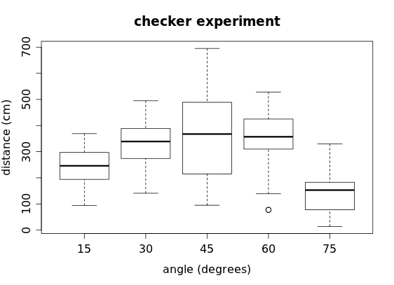
Here we can clearly see the skewness and outliers for each group, although we miss the detail of the individual data values and cannot determine anything about the modes of each group. Another option is a stripchart, where we plot the individual data values in a strip for each category:
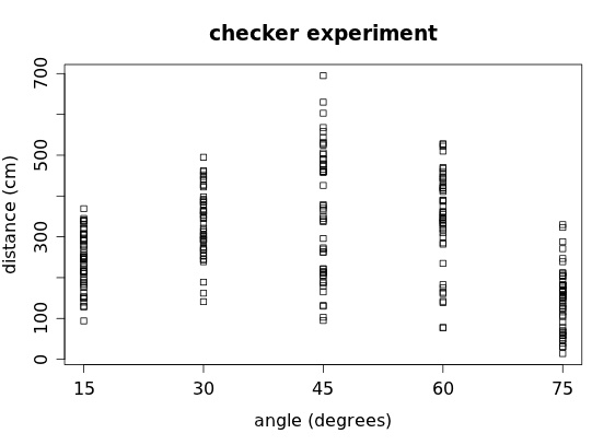
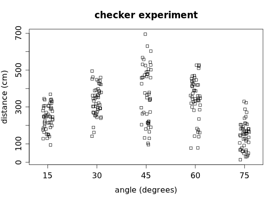
although some data values become obscured when similar values end up being plotted on top of each other. Another option is to "jitter" the dots in the stripchart slightly:
Exercises
1. Checkers Refer to the boxplots of the checker data above.
a) Which angle corresponds to the highest median distance?
b) Which angle has the biggest range?
c) Which angle has the smallest range?
d) Which angle has the biggest IQR?
e) Which angle has the smallest IQR?
f) Based on the boxplots, what appears to be the optimal angle for launching a checker?
2. [OIS 1.40] Marathon winners The histogram and boxplot below show the distribution of finishing times for winners of the New York Marathon between 1980 and 1999.
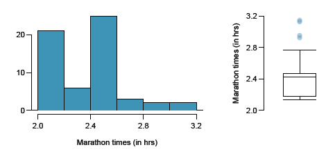
a) What features of the distribution are apparent in the histogram and not the boxplot?
b) What features are apparent in the boxplot but not in the histogram?
c) What may be the reason for the bimodal distribution? Explain.
d) The data set includes times for the fastest male and female finishers of each marathon. Compare the distribution of marathon times for men and women based on the boxplots shown
below.
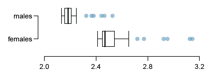
e) What important feature is missing from the boxplots shown above?
f) A time series plot (shown below) is another way to look at this data. Describe what is visible in this plot but not in the others.
