
Summarizing Quantitative Data: Range, IQR, Boxplots
In the previous section we computed the mean (37.27) and median (37) of the exam scores for 45 calculus students:
5|00
4|667889
4|00022233
3|55556667777788889
3|11112244
2|5
2|13
1|
1|2
Key: 5|0 = 50 points
These summary statistics, along with the mode (the peak around 37) help us describe a "typical" exam score or—from a different perspective—the center of the data set. But this doesn't begin to fully describe the exam scores. If everyone in this class has received the same score on the exam (say, 37), the mean and median would both be 37 but there would be absolutely no variation in the scores. We need a way to measure how much data varies above and below a central value.
From the stem-and-leaf display, it's obvious that the maximum score on the exam was 50 and the minimum score was 12. We can then define the range of this data set to be the distance between those highest and lowest scores: range = max−min = 50−12 = 38 points. Notice that we've defined range to be a single number. (In everyday writing, you might say "the scores ranged from 12 to 50," or in calculus you might say the range of a function is the interval [12,50], but now that we've given the term range a special meaning in statistics, we should say "the scores varied from 12 to 50" in order to avoid confusion.)
The range is a summary statistic that measures variation within a data set. Unfortunately, it's not a very good measurement of how "spread out" data values are. To see this, suppose the student who received a score of 12 on the exam had become ill during the test and was forced to submit his exam after a few minutes. It might not be fair under such circumstances to include his score with those of the other students, who all had nearly an hour to work on the exam. If we omit the score of 12, the range now becomes 50−21 = 29 points, a significant change; we want to avoid using summary statistics that can be drastically altered by a single data value.
When we computed the median exam scores, we separated the 45 students who took this exam into 22 at the top (shown below in bold text) and 22 at the bottom (shown below in gray text), leaving one in the middle (highlighted):
5|00
4|667889
4|00022233
3|55556667777788889
3|11112244
2|5
2|13
1|
1|2
We could now split the top 22 scores in two pieces (of 11 students each, with the top 11 shown in italics below) and do the same with the bottom 22 scores (with the bottom 11 in italics):
5|00
4|667889
4|00022233
3|55556667777788889
3|11112244
2|5
2|13
1|
1|2
The data set is now split into four pieces. Notice that a score of 34 separates the bottom quarter (25%) of the scores from the rest; we call this value the lower quartile or first quartile and denote it Q1. Likewise, a score of 42 separates the top 25% of the scores from the rest; we call this value the upper quartile or third quartile and denote it Q3. (The "second quartile" would be the median.)
We can now define the interquartile range (or IQR) as the distance between the upper and lower quartiles. For the exam scores: IQR = 42−34 = 8 points. The IQR is much less sensitive to outliers than the range.
WARNING: There are several different ways to define the first and third quartiles (depending, for example, on whether or not you include the median in the upper and lower pieces of the data set). Various calculators and computer software may report slightly different answers for the quartiles and, hence, the IQR. Don't worry about these small differences when checking your work.
We can group the min, Q1, median, Q3 and max together into a collection of summary statistics called the 5-number summary of a data set. The 5-number summary for the calculus exam score would be: 12, 34, 37, 42, 50. As noted above, these values can vary depending on the conventions used by various technology; here's the 5-number summary for this data set according to R (a widely used open source statistics package):

and a TI-83 graphing calculator, widely used in high school and college statistics courses:

The five-number summaries computed by both agree with what we computed above, but this won't always be the case.
Boxplots
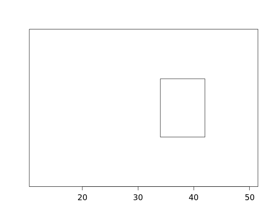
We can graph the five numbers in the 5-number summary to help us visualize the distribution of a data set. First we can draw a rectangle (or "box") extending from the lower quartile to the upper quartile:
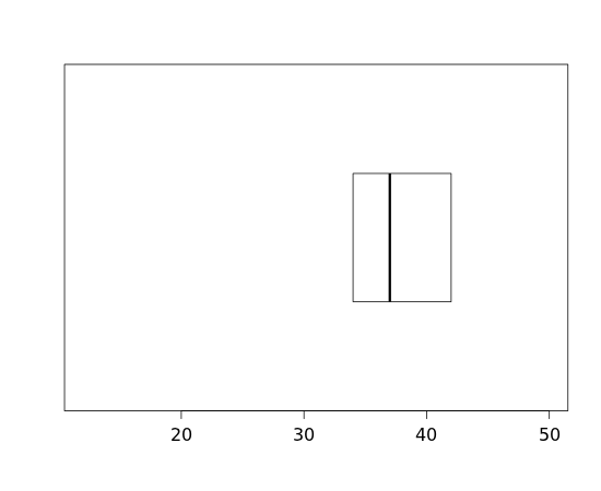
Then we can add a line segment to designate the median:
Finally we can add "whiskers" extending from the lower quartile to the min and the upper quartile to the max:
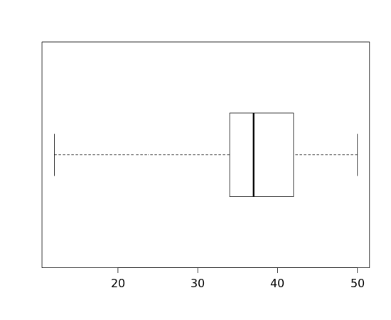
We call this graphical display a boxplot or "box-and-whiskers plot." We can also indicate outliers by plotting those data values separately from the rest of the data:
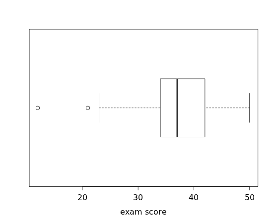
How do we determine which values are outliers? One rule of thumb defines an outlier to be any data value more than 1.5 IQRs below the lower quartile or above the upper quartile. For the exam scores, we (and R and the TI-83) determined the quartiles to be 34 and 42, so the IQR would then be 42−34=8; thus 1.5×8 = 12. We then compute 34−12 = 22, which would tell us that the scores of 12 and 21 would be considered low outliers. Similarly, 42+12 = 54, which is above the maximum score, so there are no high outliers. Generally, we'll let technology (a calculator or computer) handle this process.
Exercises
1. Here are the midterm scores for the students enrolled in third-quarter calculus class during Winter Quarter 2012:
34 24 40 43 32 47 46 30 33 50 36 48 37 36 36
a) Compute the 5-number summary.
b) Compute the IQR.
c) Draw a boxplot.
d) Are there any outliers?
e) Does the distribution appear to be positively skewed, negatively skewed or symmetric?
2. [OIS 1.36] Infant mortality The infant mortality rate is defined as the number of infant deaths per 1,000 live births. This rate is often used as an indicator of the level of health in a country. The (relative frequency) histogram below shows the distribution of estimated infant death rates in 2012 for 222 countries. (CIA Factbook, Country Comparison: Infant Mortality Rate, 2012)

a) Estimate the 5-number summary as best as you can based only on the histogram.
b) Estimate the IQR based on your answer to part a).
c) In a boxplot of this data, which would you expect to be longer: the left "whisker" or the right?
3. [OIS 1.43] Commuting times The histogram below shows the distribution of mean commuting times (in minutes) for 3,143 U.S. counties during 2010.

a) Would you expect the IQR of the commute times to be closer to 5 minutes, 10 minutes or 20 minutes?
b) Draw a rough sketch of a boxplot for this data.
4. The Ford Focus is a compact car introduced to North America in 1999 for model year 2000. The table below shows the model year, mileage (in miles) and asking price (in U.S. dollars) for all 14 used Ford Focus automobiles advertised for sale on the Web site of the Seattle Times on January 31, 2010.
| year | mileage | price |
| 2007 | 25426 | 14595 |
| 2008 | 49223 | 13991 |
| 2008 | 49028 | 13991 |
| 2008 | 27690 | 11994 |
| 2008 | 36216 | 11980 |
| 2002 | 71646 | 10991 |
| 2007 | 41107 | 9671 |
| 2002 | 83454 | 8991 |
| 2007 | 49443 | 7988 |
| 2007 | 34179 | 7499 |
| 2002 | 63439 | 7475 |
| 2005 | 43012 | 5400 |
| 2001 | 86681 | 4494 |
| 2002 | 113000 | 2000 |
a) Compute the 5-number summary for the mileage for these cars.
b) Compute the IQR of the mileage.
b) Sketch a boxplot for the mileage.
5. Compute the 5-number summary and sketch a boxplot for the number of attempts made by each student in an online class on a Web-based quiz during Fall Quarter 2006:
0|6
0|55
0|44
0|3333
0|22222222
0|11111111
0|000
Key: 0|6 = 6 attempts