
Displaying Quantitative Data
Here are scores for 45 students who took a calculus exam:
48 50 40 23 36 35 43 42 31 35 38 31 46 38 40
47 49 34 37 37 48 42 42 50 12 46 31 39 38 37
34 21 31 37 38 36 37 25 32 35 40 32 43 35 36
How might we best display these scores? One reasonable approach would be to put them in order from highest to lowest:
50 50 49 48 48 47 46 46 43 43 42 42 42 40 40
40 39 38 38 38 38 37 37 37 37 37 36 36 36 35
35 35 35 34 34 32 32 31 31 31 31 25 23 21 12
While we're at it, we could group similar scores together, for example high 40's, low 40's, high 30's, etc.:
50 50
46 46 47 48 48 49
40 40 40 42 42 42 43 43
35 35 35 35 36 36 36 37 37 37 37 37 38 38 38 38 39
31 31 31 31 32 32 34 34
25
21 23
12
A shape is beginning to appear here. We could condense this a bit by noting that each row begins with the same digit and only using each tens digit once per row:
5|00
4|667889
4|00022233
3|55556667777788889
3|11112244
2|5
2|13
1|
1|2
and including a key that explains this shorthand notation:
5|00
4|667889
4|00022233
3|55556667777788889
3|11112244
2|5
2|13
1|
1|2
Key: 5|0 = 50 points
We call this a stem-and-leaf display, where the tens digits are the stems and the ones digits the leaves. The shape of this display reveals a "peak" or mode in the upper 30's. While there is a small bump in the lower 20's, it's not clear that this bump represents any significant pattern in the data, so we wouldn't consider this a separate mode. Because the display has a single mode, we call it unimodal. The display also exhibits an unusual feature: the score of 12 that sits apart from the rest of the data set. We call a data value like this an outlier; notice that we include the stem for the upper teens, even though there is no data in that group. Ignoring the outlier for a moment, the rest of the data is roughly (although far from perfectly) symmetric.
Here is a stem-and-leaf display for exam scores from a statistics class:
10|0
9|00122356
8|07888
7|45555689
6|24467
5|6
4|23
Key: 4|1 = 41 points
This display appears to have two distinct peaks (in the 90's and the 70's), so we call this bimodal (because it has two modes). There don't appear to be any outliers in this data set. The data seems to be "stretched out" a bit more on the lower end than the upper end, as opposed to being (roughly) symmetric; as a result, we say the data is negatively skewed because it it skewed in the negative direction (toward the smaller numbers). Note that here each stem covers 10 points instead of 5.
During Fall Quarter 2006, I recorded the number of attempts made by each student in an online class on a Web-based quiz:
0|6
0|55
0|44
0|3333
0|22222222
0|11111111
0|000
Key: 0|6 = 6 attempts
This data appears to be unimodal and positively skewed (stretched out toward the upper end) with no significant outliers.
Stem-and-leaf displays are easy to generate by hand or with a simple text editor. (Be sure to use a fixed-width font, like Courier New.) We've put the higher data values at the top and the lower data values at the bottom in our stem-and-leaf displays, but some textbooks and statistical computer packages do the opposite:

These displays are also often referred to as stemplots. They work well for small- or medium-sized data sets but become impractical for larger data sets.
We can create a similar graphical display, called a dotplot, by replacing the digits of the stem-and-leaf display with dots; the calculus scores would then look like this:
50 |00
|000000
40 |00000000
|00000000000000000
30 |00000000
|0
20 |00
|
10 |0
but we lose information about the specific data values. We could also replace the dots with rectangles:
50 00
000000
40 00000000
00000000000000000
30 00000000
0
20 00
10 0
to get a display called a histogram. (I've actually just made the background color of the dots the same as the foreground text in the display above.) Generally bars in the histograms are aligned vertically rather than horizontally and we include a scale in the vertical direction to indicate the size of the counts for each bar:
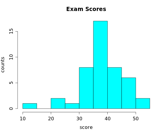
While it's not terribly difficult to create a histogram by hand, statistical programs make quick work of the task. The "bin width" (the width of the rectangle) that we use can affect the usefulness of the display. Here are four histograms of the same data (the calculus exam scores) with varying bin widths:
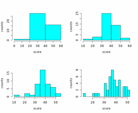
The first of these has too few rectangles to be of much use, and the last has too many. The upper-right one is OK, but most people would agree that the lower-left histogram is "just right." Most technology selects a reasonable bin size by default, but you can always adjust the settings if necessary.
Be aware that stem-and-leaf displays and histograms only work for quantitative variables; if you have categorical data, you need to use a different type of display.
Exercises
1. Here are the midterm scores for the students enrolled in a third-quarter calculus class during Winter Quarter 2012:
34 24 40 43 32 47 46 30 33 50 36 48 37 36 36
a) How many cases are included in this data set?
b) How many variables are included in this data set?
c) Create an appropriate graphical display of this data.
d) Describe the distribution of exam scores apparent in your graph.
2. [OIS 1.36] Infant mortality The infant mortality rate is defined as the number of infant deaths per 1,000 live births. This rate is often used as an indicator of the level of health in a country. The (relative frequency) histogram below shows the distribution of estimated infant death rates in 2012 for 222 countries. (CIA Factbook, Country Comparison: Infant Mortality Rate, 2012)

a) How many modes are evident in the histogram?
b) Estimate the location of the mode(s).
c) Does infant mortality appear to be symmetric, positively skewed or negatively skewed?
d) What term best describes Afghanistan, which has an estimated infant mortality rate of 121.63 deaths per live births?
e) The vertical scale shows the relative frequency (percentage of countries in each bin) rather than the counts. Just by looking at the histogram, would you be able to tell how many countries are included in the data set?
f) Approximately what percentage of countries have an infant mortality below 20 deaths per live births?
3. [OIS 1.43] Commuting times The histogram below shows the distribution of mean commuting times (in minutes) for 3,143 U.S. counties during 2010.

a) Describe the distribution of commuting times shown in this histogram (modality, skewness, outliers).
b) Would a stem-and-leaf display be appropriate for this data set?
4. The Ford Focus is a compact car introduced to North America in 1999 for model year 2000. The table below shows the model year, mileage (in miles) and asking price (in dollars) for all 14 used Ford Focus automobiles advertised for sale on the Web site of the Seattle Times on January 31, 2010.
| year | mileage | price |
| 2007 | 25426 | 14595 |
| 2008 | 49223 | 13991 |
| 2008 | 49028 | 13991 |
| 2008 | 27690 | 11994 |
| 2008 | 36216 | 11980 |
| 2002 | 71646 | 10991 |
| 2007 | 41107 | 9671 |
| 2002 | 83454 | 8991 |
| 2007 | 49443 | 7988 |
| 2007 | 34179 | 7499 |
| 2002 | 63439 | 7475 |
| 2005 | 43012 | 5400 |
| 2001 | 86681 | 4494 |
| 2002 | 113000 | 2000 |
a) Create an appropriate graphical display of the mileage variable and describe the distribution.
b) Create an appropriate graphical display of the price variable and describe the distribution.